Designing a poster for a political campaign is an important task that requires careful consideration of various design elements. The poster should effectively communicate your message to the target audience and create a strong visual impact.
You can create a poster online using different platforms. For example, StoryboardThat allows users to create professional-looking posters with a variety of templates and design elements. However, you should know the basics before starting to work on your design.
This guide will explore tips and best practices for designing a compelling political poster to help your campaign stand out and connect with your audience. From choosing the right colors and typography to using imagery and promoting your poster on social media, we will cover everything you need to know to create an influential political poster.
Define Your Message
The message of a political campaign poster is a brief statement that summarizes the main idea and highlights the campaign’s critical issues. It should be clear and concise, effectively communicating the campaign’s message to the audience. The message should be defined before designing the poster to ensure that all elements of the design support and reinforce it.
Select Colors And Typography
The colors should be bold and striking, as they will help grab potential voters’ attention. Remember the message you want to convey with the poster – the colors should be well-suited for that message. For example, red is often associated with power and energy, while blue is associated with trust and stability. Keep in mind that colors can have different meanings and political symbolism in different countries.
In terms of typography, it’s essential to choose a font that is clear and easy to read. Avoid overly decorative fonts, as they can be difficult to read from a distance. Instead, opt for a simple and clean font that will be easy to read and understand.
Using hierarchy in your typography is vital to emphasize the most critical information. You can achieve this by using different font sizes and colors for different pieces of information on the poster.
Choose The Right Images
When selecting images for a political campaign poster, it’s crucial to pick powerful, compelling images that effectively convey the message. Here are some things to consider when selecting images:
- Relevance: The image should be directly related to the campaign message or theme.
- Emotion: It should evoke an emotional response in viewers, such as hope, optimism, or determination. For example, an image of people from diverse backgrounds working together towards a common goal can evoke a feeling of unity.
- Composition: The image should be well-composed and easy to read, with a clear focal point and good use of color and contrast. It’s also important to consider the legal aspect of using images, such as if it is copyrighted or if you have permission to use it.
- Audience: Different demographics may respond differently, so select images that resonate with the specific voters you’re trying to reach. For example, if you’re targeting younger voters, use more modern and relatable images. For older voters, go for images that evoke nostalgia or tradition. Additionally, if you want to target a specific demographic, such as a minority group, you can use images that represent that group positively and inclusively.
Use A Grid System
Designing a poster using a grid system effectively ensures that all elements are aligned, creating a visually appealing and organized design. To start, you can create a rough sketch of the layout and divide it into columns and rows to form a grid. It will align all elements, such as text, images, and graphics, ensuring they are evenly balanced across the poster.
Preview And Adjust
Preview your poster, preferably on several devices to be sure of the quality, and make any necessary adjustments. Check the alignment, color balance, and readability of the text.
Print And Distribute
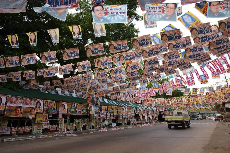
Once you are satisfied with the design, print your poster and distribute it in various locations such as bus stops, billboards, public places, etc.
Evaluate The Effectiveness
Finally, evaluate the poster’s effectiveness by tracking the target audience’s response and adjusting for future campaign designs.
Conclusion
Designing a political campaign poster requires understanding the campaign’s goals, target audience, and key messaging points. It should be legible, aesthetically pleasant, and consistent with the campaign’s visual identity and messaging strategy. Testing the poster with the target audience is vital to ensure it effectively communicates the campaign’s message and stands out among the competition.


